It is my goal as a blogger to bring you beautiful and inspiring images, but I must warn you this post is not beautiful nor is it inspiring. It is down right ugly. Mr. Mayhem and I have been scheming for a while to revamp the upstairs bathroom a bit. We had to wait however because there was a college student living in our basement using the second bathroom. This project may cause our bathroom to be out of commission for an unknown period of time making the 2nd bathroom a necessity. The co-ed moved out just before Christmas after successfully completing her education degree (congrats!) and is now onto bigger and better things (ie. student teaching). Now that she is gone and the holidays are over it is time for project "Bathroom Revamp" to commence. I'm calling it revamp because it is not a full blown remodel we are just going to tweak some of the functional and aesthetic problems in the room, but the main guts are going to remain intact.
So here is the before image. I agree it is not the worst bathroom in the world that is why it has remained untouched for 1 1/2 years of home ownership, but the time has come to put my style in the bathroom.

The first thing to go will definitely be these grandma curtains. I have a beautiful DIY roman shade plan that I can't wait to show you!!
Other ugly elements that will definitely go bye-bye are this industrial TP dispenser.
and the space-aged Jetsen's light fixture. Not to mention the fact that it is not centered over the mirror and vanity. Speaking of the mirror it too will be revamped. Not replaced, revamped. I have a fun DIY plan for that too! Stay tuned!
The butter yellow color will be painted over. The whole wall behind the mirror is very uneven and rough. (It was hard to show in a photograph) That issue will also be addressed.
The second bad (dysfunctional) part of the bathroom is the vanity. It will reappear in the good section because do really like it. The problem is that this is all the storage this bathroom offers. I have some creative ways to add more storage to this tiny bathroom!

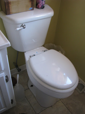
Blah! After all that ugly and bad, let's get to what is actually good about this bathroom. First of all it has ok bones. By bones I mean the big stuff. The toilet is in good shape. One small chip in the lid from hitting the flusher, but that will be either fixed or replaced.
The flooring is in good shape, is neutral, and will go with my design plan.
The shower curtain is in good shape. It is white if you can't tell from the picture. It has a waffle sort of pattern. It may or may not be replaced during the revamp. Budget and finding something that "speaks" to me will be the determining factors. The curtain rod however will be replaced.
The facets match and are quite cute. Sorry for the soap scum in the second picture. Hard water sucks and you can't say I didn't warn you about the ugly factor.
And finally in the good. The vanity. It is a nice color/size for the space, so it stays.
Stay tuned for the progression of the bathroom revamp. The next couple of posts will deal with my plan and inspiration for the space then we will start to tackle all the projects. Any fun revamps starting over at your place? Do share!


No comments:
Post a Comment